Data Visualization, Discovery and Visual Analytics
Scorecards, Dashboards, Heatmaps, Alerts, Management Reporting, Operations and Transactions Reporting are all enterprise example of data visualization outputs.
Some data visualization use cases include:
- Data Scientist — uses QlikView to visualize and extend statistical models built in “R”, a programming language used for statistical modeling, to understand traffic flows and congestion patterns and advise on options to improve travel times for Amazon.com Local delivery drivers.
- Pharmaceutical Sales Representative — uses QlikView on an iPad to access current industry sales trends and doctor prescription history while on a sales call with a busy physician.
- Healthcare Chief Medical Officer — uses Tableau Software to analyze all aspects of hospital performance including population management, emergency room effectiveness and Affordable Care Act compliance.
- Crime Analyst— uses Microstrategy to maintain a consolidated view of crime levels and optimize staffing allocations to dispatch police into high crime areas.
- Retail Store Manager — uses QlikView to analyze which products are selling best which impacts store assortments and which products get featured vs which ones get discontinued.
- Telecom Customer Service Agent — uses Spotfire to monitor call center statistics and how it translates into customer satisfaction and retention.
From these use cases you can see that there are many different ways of asking questions and telling a story. The story in the enterprise typically is around the these Use Cases:
- Interactive Modeling - Speed-of-Thought Analysis, What-if Analysis and Forecasting, Rapid Scenario Planning
- Scorecards - Personalized scorecards, Measure against goals, "At a Glance" information on Business Performance, Convey information in intuitive format
- Dashboards - Support "what-if" scenarios, Drill down capabilities, Visualize Key Performance Indicators (KPIs)
- Management Reporting - KPI monitoring, Briefing Books, Summarized views
- Operations and Transaction Reporting - Alerts, summarized views of day-to-day activities of the batch and raw data reporting
Dashboard example from Proctor & Gamble. 

Enterprise Data Visualization Fundamentals
Data visualization is the software to help companies analyze large amounts of data through easy-to-read charts and graphs. It's the use of abstract, non-representational pictures to show numbers by means of the combined use of images, diagrams, animations, points, lines, a coordinate system, numbers, symbols, shading, words, and color-coding. Visualization today has ever-expanding applications in business, science, education, engineering (e.g., product visualization).
A big complaint from business users.... BI platforms and big data today increasingly suffer from poor visualization. Most organizations are data rich, information poor and insights starved. Lots of tools, new technology and data but insights are hard to visualize from the background data noise.
Transaction automation and multi-party data aggregation is no longer the focal point. The problem has shifted to effective use. It’s interesting how in almost every meeting I am in, More Effective Data Visualization (and Improving User Experience at even reports/dashboard level), is coming up as key business initiative. There is a growing demand to enable everyday business users to answer critical questions with ease (self-service visualization).
In the quest to help employees and customers see and understand data, enterprise Data Visualization initiatives tend to have five basic objectives:
- Reporting and BI can only be as good as what source data you have... so ability to connect to internal, private and public data sources to produce visualizations is key
- Exploration of the content of a data set (e.g., location-based visualization in mobile applications that helps users complete tasks more instinctively, such as locating a hotel, checking inventory levels, or finding the closest store.)
- Find structure in data (correlations etc.)
- Checking assumptions in statistical models (causation, root cause analysis etc.)
- Communicate the results of an analysis in easy to consume way (e.g. mobile consumption where intuitiveness is paramount) .
The challenge for executives and senior leadership today is - How do we increase the maturity of Analytics and Visualization area? In a fragmented landscape... how do we benchmark our current state? What structural changes - skillsets, toolsets, mindsets -- need to be made to become world-class? How can we drive more business value quicker from all these tool/platform investments? How do we go beyond the current core audience, which has been business, and reach out to the mobile customer/consumer?
The following is an example of a Consumer Apps Dashboard from fitport. Simple but information rich on a 5.5 inch screen.
Better Data Visualization – a Growing Trend
"By visualizing information, we turn it into a landscape that you can explore with your eyes, a sort of information map. And when you're lost in information, an information map is kind of useful." -- David McCandless TED talk
The expectations of the enterprise users around intuitive, user-friendly interfaces are rapidly shifting forcing enterprise BI firms and application developers to react. The focus is on enabling users to explore and analyze data with simple drag-and-drop operations.
Consumer user experience and engagement are the new standard for enterprise applications. Consumer innovations like iPhone which allow users to utilize drag-and-drop gestures to execute queries, seamlessly shift graphical perspectives on their data and easily answer new questions as their thinking progresses are the new norm.
Improving user engagement around dashboards is a key strategic goal. There is no disputing that organizations increasingly regard their data as a critical strategic resource. The remarkable growth in the volume, diversity and accessibility of digital information creates the potential for people to make more informed, timely and intelligent decisions. Improvements in access, processing, and analytics speed can increase user engagement with data and enhance the range, quality and timeliness of insights that are developed.
Visualization improvements are key to comprehending data volume, velocity and variety. According to IDC, the amount of digital information created, replicated and consumed will grow from 0.8 trillion GB in 2010 to 40 trillion GBin 2020. Many organizations will experience a doubling in the volume of data across their enterprises every 24 months, according to IDC, and are investing heavily to scale their data storage and management platforms to accommodate this growth. These growing volumes of data are also diverse in terms of their source, format and location.
End User Demand for Better Visualization
"the really difficult thing [is] formulating questions that we are currently too stupid to ask now, let alone understand the answers to." -- Neil deGrasse Tyson
Query -> Reporting -> Scorecards -> Dashboards -> Interactive Visualization -> Analytical Modeling is the demand trajectory in most organizations.
In August 2012, Forrester Research estimated that there will be 615 million information workers globally in 2013 and it predicts that number to grow to 865 million by 2016. Additionally, a Forrester survey of information workers conducted in the fourth quarter of 2012 indicated that only 17% of respondents use a data dashboard or BI tools as part of their job. A significant percentage of information workers are not accessing BI software, and they instead use alternative approaches to meet their analytical needs.
As a consequence of the increasing richness and volume of data, knowledge workers are demanding agile analysis – faster access to information in order to gain insight, solve problems and monitor the performance of their organizations. The growth of cloud computing technologies and the proliferation of connected devices such as tablets and smartphones are enabling users to access information anytime and anyplace.
These trends are accelerating the demand for next generation Visual Analytics and Data Visualization technology, as more information and engagement provokes more questions and fuels demand for more analysis, answers and value. At the same time, advances in user experience driven by consumer technology companies such as Amazon, Apple, Facebook and Google have raised user expectations regarding intuitive, flexible and convenient access to information.
These factors have created a backdrop of growing data resources, increased user appetite for information and rising expectations for accessibility and ease of use. As a result, many organizations are seeking technology that will allow their people to easily access the right information, answer questions, gain insight and share their findings. These organizations are seeking to empower their employees and to unleash their creativity and problem-solving abilities.
Static Reports are Dead
Impactful and engaging visualization is the next frontier.
People within organizations have traditionally accessed data via static reports from enterprise applications and business intelligence platforms maintained by IT departments. These systems, predominantly designed and built in the 1990’s, are generally heavy, complex, inflexible and expensive. As a result, business users are forced to depend on specialized resources to operate, modify and maintain these systems.
The divide between users seeking insight and technical specialists lacking business context introduces inefficiencies and time lags that inhibit the utility and value of these systems. Because most business users lack the time, skills and financial resources necessary to address the limitations of these systems, their adoption has largely been limited to a narrow population of power users with technical expertise and training and to a narrow population of companies.
Faced with these challenges, many knowledge workers today rely on spreadsheets as their primary analytical tool. While spreadsheets are widely available and easier to use than traditional BI platforms, they have a number of limitations. Spreadsheets are not generally designed to facilitate direct and dynamic data access, making the process of importing and updating data manual, cumbersome and error prone. In addition, spreadsheets are not built to accommodate large data sets and offer limited interactive visual capabilities, thereby reducing performance and limiting analytical scope and insight.
“Aggregate -> Explore -> Analyze -> Visualize” Vendors
There are four categories of Data Visualization vendors
- Spreadsheet software providers, such as Microsoft
- Emerging business analytics software companies, such as Tableau Software, Qlik Technologies Inc. and TIBCO Spotfire.
- Enterprise software companies, including suppliers of traditional BI products that provide one or more capabilities that are competitive with our products, such as MicroStrategy, IBM Cognos, Microsoft, Oracle and SAP AG;
- Traditional Statistical and Computation vendors like SAS, SPSS, Mathematica who allow you to do complex visual analysis… filter, sort, perform aggregations, and summarize;
- and others..
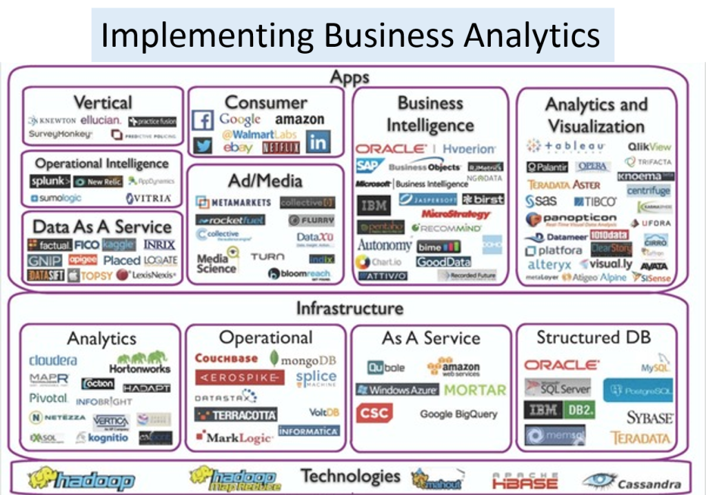
Almost every vendor in the Business Analytics landscape (see figure below) is going after the Data Visualization space as a strategy. Enterprise grade BI tools are expensive although price points are coming down as competitors like Tableau are gaining marketshare.
The future is mobile data visualization....Tableau, for instance, is taking the wraps off a new project called Elastic, which will bring the company’s style of simplified data analysis to tablet users. The goal is to let small businesses and individuals enjoy analyzing their data, bypassing desktop tools.
The Limitations of Enterprise BI Platforms
Most traditional BI tools were developed specifically for data analysts and other quantitative professionals, like statisticians, and are driven and deployed by IT departments in a top-down approach. These systems require sophisticated programming skills to construct or modify predefined, inflexible data sets, known as “data cubes.” These tools are used by data analysts or IT professionals to produce static reports or pre-configured dashboards which the business user cannot easily modify or explore in an interactive manner. A typical business user does not possess the skills or authority needed to modify the underlying data cube and therefore must engage their IT departments to reconfigure the analysis to produce the requested information between each decision cycle. The decision cycle may be as short as a follow-on question occurring to a business user as they begin to explore a data set. As a result, business users often do not have access to critical data in a timely manner and may miss important insights and opportunities.
Traditional BI solutions require the development of a pre-defined summarization of the data, or data warehouse to support static query and reporting tools. These tasks can be time-consuming and complex and often require significant professional services support to complete. In addition, traditional BI solutions can be difficult to update and require substantial investments to refresh the underlying data.
Traditional BI solutions have become complex product “stacks” that combine multiple disparate products into a single “solution.” Due to the complexities and overhead of these large stacks, we believe that a typical BI implementation takes twelve to eighteen months, or more. By that time the business, and the business user requirements, may have significantly evolved or changed, resulting in an extensive queue of user requests to update and revise reports or dashboards. Even simple changes can take weeks or months to implement resulting in a solution that we believe is always a few steps behind the business user’s requirements.
As a result, most BI products can only help people answer questions that are understood in advance. In contrast, next generation data discovery platforms are designed to enable users to explore live data, and uncover insights they can use to see hidden trends, make discoveries and solve problems in new ways.
The newer breed of data visualization tools offer data analysts easier, and less complex tools for creating compelling data visualizations. For instance, Qlikview Business Discovery platform empowers non-technical users to explore data freely, with just clicks, learning at each step along the way and coming up with next steps based on those findings naturally. Qlik calls this Natural Analytics™ — an approach that utilizes people’s innate ability to detect patterns, compare, sort and categorize information, anticipate outcomes and collaborate on decisions.
The objective is to:
- Enable users to explore complex data, making and sharing discoveries using natural human abilities rather than being taught advanced techniques;
- optimize data structures, the analytical query engine, the interactive user experience, visualizations and collaboration;
- encourage browsing and exploration, categorization and other decision making processes, tapping into our natural human ability to process complex information; and
- replicate the way the human brain searches for information, makes connections between various findings and uncovers insights through association, comparison and anticipation.
While most firms have implemented traditional BI platforms like SAP BusinessObjects or IBM Cognos, they are realizing that these platforms fail to provide timely and innovative insights to business users due to inflexible data architecture, poor usability and substantial upgrade time and costs. As a result of these limitations, many business users have turned to alternative tools like spreadsheets or local MS-Access databases to help them perform data analysis. However, these general productivity tools were not specifically designed to facilitate interactivity, collaboration and aggregation and exploration of data for decision making. Furthermore, lacking a centralized infrastructure, users of these tools often end up with different answers resulting from a “dueling spreadsheets” problem.
Next State...Bringing Data to Life
More effective consumption of data is the target for almost every organization. The focus is on allowing users to see and understand data. The five capabilities that are needed to enable easier consumption of data include:
- Self-Service -- The simplicity and ease of use of next gen software vendors like Qliktech, Tableau Software or Spotfire gives people the power to access, analyze and share data without the assistance of technical specialists. This self-service capability democratizes access to data, expands the potential user population within organizations and reduces training and support costs.
- Discovery — The human mind is better able to process information, discern trends and identify patterns when presented with information in a visual format. By integrating data analysis and visualization, our software allows people to create powerful visualizations and dashboards that can lead to new discoveries. New capabilities from vendors is designed to seamlessly blend, filter and drill down on information, without the distraction of dialogue boxes, wizards and scripts, allowing users to rapidly and iteratively develop greater insight from their data.
- Mobility. Business decision makers at all levels in an organization need readily available data. Tablets, phablets, phones and other mobile devices help to make business data ubiquitous. Unlike traditional BI solutions, which address the need for mobile solutions by delivering static reports and dashboards to mobile devices, mobile Business Discovery platform provides an intuitive interface and an application infrastructure that is designed to enable users to explore data and draw associations and insights wherever they happen to be working.
- Speed — Enable people to derive value from their data at an accelerated pace. Due to a growing focus on ease of use and ease of deployment, enterprise users can quickly gain proficiency and generate results rapidly, without the complication, time investment and frustration often associated with traditional BI products.
- Linkage -- New software is able to connect directly to a broad range of data sources, enterprise users can perform work without having to undertake complex and time-consuming data movement and transformation.
QLIKVIEWTableau SoftwareSalesforce.com WAVE |
COGNOSSAP BusinessObjects |
SASIBM SPSS |
EXCEL |
|
|
|
|
|
IT Report Authors | Statisticians | Analysts and Consumers |
Enabling Better Decision Making via Data Visualization Center of Excellence (CoE)
“How do we create a flexible model for Data Visualization delivery that provides discipline at the core while giving the business the agility that they need to make decisions or meet client needs?”
Decision making is inherently a core business activity. Slow, rigid systems are no longer good enough for business users or the IT teams that support them. Competitive pressures and new sources of data are creating new requirements. Users are demanding the ability to answer their questions quickly and easily.
Target state -- empower business users along the Discover, Decide and Do lifecycle:
- Discover new insights by rapidly accessing and understanding data in ways that fit how people naturally think and ask questions.
- Decide on best actions by collaborating with others, discussing insights and persuading others through data presented in an interactive application (“app”) rather than in a static view.
- Do what is best at each decision point with confidence, based on the consensus that develops when new data is analyzed and explored with multiple associations and different points of view. Teams can take action more rapidly and move projects forward more effectively when everyone understands the data underlying decisions.
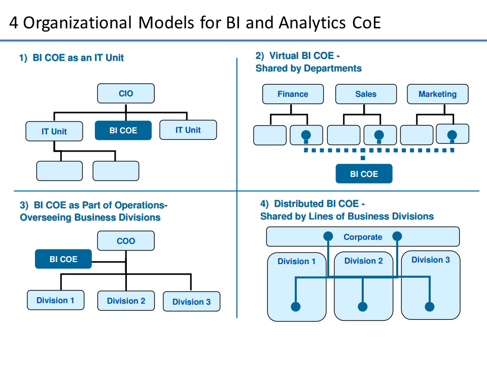
The challenge for IT and Application Teams in every organization is to deliver exceptional business value to their business partners quickly and consistently while maintaining governance and control. Establishing a Data Visualization Center of Excellence (DVCoE) ensures that the people, process and technology investments are not duplicated and addressed in a way that maximizes ROI and enhances IT-Business partnership.
What is the business imperative being supported by DVCoE?
Reporting |
||
| * | Departmental Reporting | Static and/or parameterized reports built for internal user audiences - less need for pixel-perfect rendering and complex presentation |
| * | Corporate Reporting | Static and/or parameterized reports built for external and executive audiences (including regulatory reports) - pixel perfect and/or complex presentation |
| * | Ad-Hoc Reporting | Query or batch-based data delivery from one-off or custom requests - delivery in data set, spreadsheet or custom report form |
Discovery, Analysis, and Visualization |
||
| * | Business Discovery | Visual exploration of disparate data by business users for the purposes of discovery, what-ifs, scenarios, trending and correlations that are not yet known |
| * | Visualization | Interactive exploration of data by data practitioners, for the purposes of Pre-ETL, Correlation Analysis, Data Profiling, Data Quality, etc… |
| * | Prototyping | Rapid models and interface prototypes to prove out business value and technological fit |
Advanced Analytics |
||
| * | Statistical Analytics | Statistical analysis, trending and reporting - beyond basic statistical analysis. These are statistical/scientific analysis based on advanced modeling. |
| * | Predictive Analytics | Predictive analysis, projections, scenarios and models for future events based on historical data and controllable variables - beyond projections, what-ifs. |
DVCoE -- Fundamentals
How can we create a group that will help business see thru the noise of data. While every organization will vary in terms of what business needs they need supported…the basics of any DVCoE are the same. They include Charter, People, Technology Process and Service Management.
-
Charter and Setup
- Vision -> Establish a guide post
- Executive Sponsorship -> Eliminate roadblocks to change
- Delivery Patterns -> Determine what will be delivered
- Project Intake -> Outline how new work will be accepted
-
People
- Roles -> Determine what resources are needed
- Team Structure -> Determine who will reside in IT or the business
- Collaboration Process -> Establish guidelines on how work is done and decisions made
- Onboarding Process -> Establish methods for on-boarding new people
-
Technology Process
- Best Practices -> Document development and UI guidelines
- Delivery Process -> Develop process for application implementation
- Governance Model -> Ensure ongoing environment stability and consistency
-
Service Management
- Metrics & KPIs -> Quantitatively define success
- Support Model -> Determine who is responsible when help is needed
- Service Level Agreements -> Establish committed SLAs
- Chargeback Model -> Establish mechanism for cost recovery
See my previous post on BI CoE or Competency Centers for a more in-depth discussion.
Selecting a Data Visualization Vendor - Tableau Software
Tableau Software, Inc. provides various business analytics software products in the United States, Canada, and internationally. The company was founded in 2003 and is headquartered in Seattle, Washington.
It offers Tableau Desktop, a self-service analytics product that empowers people to access and analyze data without IT involvement; and Tableau Server, a business intelligence platform with data management, scalability, and security to foster the sharing of data, as well as to improve the dissemination of information in an organization, and promote enhanced decision-making.
The company also offers Tableau Online, a cloud-based hosted version of Tableau Server; and Tableau Public, a cloud-based platform that allows the users of bloggers, journalists, researchers, and government workers to visualize public data on their Websites. It also provides related maintenance and support, and training and professional services.
Tableau sells its products directly, as well as through technology vendors, resellers, OEMs, and independent software vendor partners. It has strategic alliance with Splunk Inc. to enhance the visual analytics and machine data; and strategic partnership with Brillio.
Tableau generates revenues in the form of license fees and related maintenance and services fees. License revenues reflect the revenues recognized from sales of licenses to new customer accounts and additional licenses to existing customer accounts. License fees include perpetual, term, and subscription license fees. Maintenance and services revenues reflect the revenues recognized from fees paid for maintenance services (including support and unspecified upgrades and enhancements when and if they are available) and, to a lesser extent, for training and professional services. When purchasing a license, a customer also typically purchases one year of maintenance service and has the opportunity to purchase maintenance service annually thereafter.
Selecting a Data Visualization Vendor - Qlikview
Qlik Technologies Inc. provides user-driven business intelligence solution that enables customers to make business decisions. The company was founded in 1993 and is headquartered in Radnor, Pennsylvania.
The company offers QlikView Business Discovery platform, which enables business users to explore data; ask and answer their own stream of questions; and follow their own path to insight on their own, and in teams and groups. It also provides license, maintenance, and professional services.
Competitive Positioning.... Qlik's Business Discovery platform is powered by an in-memory engine which maintains associations in data and calculates aggregations rapidly, as business users interact with the software. The software platform is designed to give customers significant improvements in usability, flexibility and performance at lower costs compared to traditional BI solutions.
The customer base consisted of ~35,000 active customers of flagship product QlikView. Qlik serves various industry verticals, such as consumer packaged goods, financial services, pharmaceuticals, retail, manufacturing, technology, and healthcare. Qlik Technologies Inc. sells its products through its direct sales force, as well as through an indirect channel partners, including distribution partners, value-added resellers, system integrators, and original equipment manufacturers (OEM) to license and support its software platform. It serves customers in the Americas, Europe, and internationally.
Salesforce.com Wave
Salesforce.com entered the $38 billion analytics market with the launch of its sixth cloud in the Salesforce Platform. Wave is the cloud analytics platform designed for every salesforce user. Companies can now quickly deploy sales, service and marketing analytics, or build custom mobile analytics apps, using any data source.
Wave is natively integrated with the Salesforce1 Platform and shares the same single sign-on, data security and compliance features of the platform. This enables users to quickly drag and drop data from Salesforce, including data from partner apps built on the platform, to deploy sales, service and marketing analytics apps. In addition, developers and IT can use Wave APIs and other data connectors to easily connect to third-party data sources—from structured SAP and Oracle data to unstructured machine and social data. And because Wave is a platform, developers can also build custom analytics apps for any business function, or embed analytics into a new generation of apps and connected products for customers.
IBM Cognos
IBM Cognos is a full BI and performance management suite. Dashboards and data visualization provide the front end of a much larger solution suite that spans across multiple departments and vertical industries. IBM offers a broader range of hardware and business software with Cognos providing the intelligence layer of the overall stack.
SAP Business Objects
SAP Business Objects is a BI solution set within SAP’s larger suite. SAP offers solutions for different verticals and departments that include overall BI suites as well as reporting solutions (Crystal) and interactive dashboards (XCelsius). These dashboards can be deployed independently or as part of a larger BI solution.
Dundas Data Visualization
Dundas offers data visualization solutions for .NET, SQL Server Reporting Services and SharePoint. Dundas provides products to enable the development of charts, key performance indicator (KPI) analysis, general dashboards and scorecards, and geographic data analysis.
Summary
One of the easiest ways to make sense of data is to visualize it. In addition to complex computational and statistical data manipulations, it is important to have an effective visual exploration tool to help with the extraction of information from large heaps of data.
Sources and References
- http://en.wikipedia.org/wiki/Visual_analytics
- The Visual Display of Quantitative Information by Edward R. Tufte
- Qlikview in the Enterprise - Center of Excellence
- Statistical graphics, also known as graphical techniques, are information graphics in the field of statistics used to visualize quantitative data. Whereas statistics and data analysis procedures generally yield their output in numeric or tabular form, graphical techniques allow such results to be displayed in some sort of pictorial form. They include plots such as scatter plots, histograms, probability plots, spaghetti plots, residual plots, box plots, block plots and biplots … http://en.wikipedia.org/wiki/Statistical_graphics
- Journalism in the Age of Data... http://datajournalism.stanford.edu/
- A great Tumblr blog for visualization examples and inspiration: vizualize.tumblr.com
- Data Visualization - Medium is the Message Post
Posts by Tag
- big data (41)
- advanced analytics (38)
- business perspective solutions (30)
- predictive analytics (25)
- business insights (24)
- data analytics infrastructure (17)
- analytics (16)
- banking (15)
- fintech (15)
- regulatory compliance (15)
- risk management (15)
- regtech (13)
- machine learning (12)
- quantitative analytics (12)
- BI (11)
- big data visualization presentation (11)
- community banking (11)
- AML (10)
- social media (10)
- AML/BSA (9)
- Big Data Prescriptions (9)
- analytics as a service (9)
- banking regulation (9)
- data scientist (9)
- social media marketing (9)
- Comminity Banks (8)
- financial risk (8)
- innovation (8)
- marketing (8)
- regulation (8)
- Digital ID-Proofing (7)
- data analytics (7)
- money laundering (7)
- AI (6)
- AI led digital banking (6)
- AML/BSA/CTF (6)
- Big Data practicioner (6)
- CIO (6)
- Performance Management (6)
- agile compliance (6)
- banking performance (6)
- digital banking (6)
- visualization (6)
- AML/BSA/CFT (5)
- KYC (5)
- data-as-a-service (5)
- email marketing (5)
- industrial big data (5)
- risk manangement (5)
- self-sovereign identity (5)
- verifiable credential (5)
- Hadoop (4)
- KPI (4)
- MoSoLoCo (4)
- NoSQL (4)
- buying cycle (4)
- identity (4)
- instrumentation (4)
- manatoko (4)
- mathematical models (4)
- sales (4)
- 2015 (3)
- bitcoin (3)
- blockchain (3)
- core banking (3)
- customer analyitcs (3)
- direct marketing (3)
- model validation (3)
- risk managemen (3)
- wearable computing (3)
- zero-knowledge proof (3)
- zkp (3)
- Agile (2)
- Cloud Banking (2)
- FFIEC (2)
- Internet of Things (2)
- IoT (2)
- PPP (2)
- PreReview (2)
- SaaS (2)
- Sales 2.0 (2)
- The Cloud is the Bank (2)
- Wal-Mart (2)
- data sprawl (2)
- digital marketing (2)
- disruptive technologies (2)
- email conversions (2)
- mobile marketing (2)
- new data types (2)
- privacy (2)
- risk (2)
- virtual currency (2)
- 2014 (1)
- 2025 (1)
- 3D printing (1)
- AMLA2020 (1)
- BOI (1)
- DAAS (1)
- Do you Hadoop (1)
- FinCEN_BOI (1)
- Goldman Sachs (1)
- HealthKit (1)
- Joseph Schumpeter (1)
- Manatoko_boir (1)
- NationalPriorites (1)
- PaaS (1)
- Sand Hill IoT 50 (1)
- Spark (1)
- agentic ai (1)
- apple healthcare (1)
- beneficial_owener (1)
- bsa (1)
- cancer immunotherapy (1)
- ccpa (1)
- currency (1)
- erc (1)
- fincen (1)
- fraud (1)
- health app (1)
- healthcare analytics (1)
- modelling (1)
- occam's razor (1)
- outlook (1)
- paycheck protection (1)
- personal computer (1)
- sandbox (1)
Recent Posts
Popular Posts
The number 150 has a nice symmetry to it:...
Amberoon's bank-by-bank analysis reveals a...
That's not the setup to a joke. That's the news.


